Photorealistic AI images rarely come from the phrase “make it realistic” alone. The wording has to tell the model what a camera would see: how the light falls, how the lens frames the subject, and which flaws to avoid.
That is the short answer to how prompt engineering affects photorealistic output. Build your prompt like a photographer’s checklist, then test one change at a time. Apiframe gives you one API for trying 70+ image, video, and music models without rebuilding your integration. If you are new to image APIs, our AI image API guide is a good place to start.
What Prompt Engineering Changes in a Photorealistic Image
Prompt engineering changes how the model reads the scene. A short prompt such as “a woman by a window” leaves too many choices open. The model has to guess her age, pose, light source, camera position, background, and mood.
A stronger prompt settles those choices. It might describe an older woman seated beside a kitchen window, with soft overcast light on one side of her face, visible skin texture, and a background that falls out of focus. Each phrase narrows the range of possible images.
This is why prompt structure matters more than the number of adjectives you stack up. The model turns your words into visual patterns it picked up during training, instead of reading them the way a human photographer would.
A useful six-part structure is:
- Subject: who or what appears in the frame.
- Action: what the subject is doing.
- Environment: where the scene takes place.
- Style: the photographic or visual treatment.
- Lighting: the source, direction, softness, and mood of the light.
- Details: textures, framing, color, and small physical cues.
The order can change from model to model, but the coverage matters. Missing lighting often makes an image look flat. Missing the setting can leave the subject floating. Missing material detail can produce smooth skin, fake-looking cloth, or plastic metal.
For a model-specific example, our Midjourney prompt guide shows how to combine subject, environment, style, lighting, composition, and settings in one line. Apiframe also lets you run the same prompt against different models by changing the model field, which makes side-by-side testing much easier. Our AI image API comparison shows how several popular models differ.
Camera, Lens, Lighting, and Depth of Field Cues
Camera language gives the model a visual target. It does not mean the model is simulating a real camera, but it can steer the image toward familiar photographic patterns.
Start with the focal length, which is the number in millimeters that describes how wide or tight the view is. A 35mm lens suggests a wider view with more room around the subject. A 50mm lens gives a familiar, everyday perspective. An 85mm portrait lens points toward tighter framing and stronger separation between the subject and the background.
Then add the aperture when depth of field matters. Depth of field is simply how much of the scene stays sharp. A phrase such as “85mm lens, f/1.8, sharp focus on the eyes, soft background blur” gives the model several linked cues. It can hold the face sharp while pushing the background out of focus.
Do not write “blurry background” on its own. That can lead to a smudged image instead of believable lens blur. Pair depth of field with a lens, a distance, or a focus point.
Lighting usually has the biggest effect. Look at almost any prompt advice aimed at photographic realism and lighting is part of it. The useful part is the level of detail. “Natural window light from the left” tells the model much more than “nice lighting.”
Describe four things when you can:
- Where the light comes from.
- How hard or soft it is.
- Which surfaces it reaches.
- What kind of shadow it creates.
For example, “soft overcast daylight from a large window, gentle cheek shadows, cool ambient fill” gives the face a believable light pattern. “Warm late-afternoon sunlight through blinds” adds direction and a reason for the shadow shapes.
Use studio terms when the scene calls for control. Softbox lighting, rim light (a light from behind that outlines the subject), Rembrandt lighting (a small triangle of light on the shadowed cheek), and practical lights, meaning lamps that appear in the shot, can all guide the model. But do not combine them without a reason. A portrait with bright noon sun, a softbox, blue-hour light, and candlelight is a confused lighting brief.
Film grain and light haze can help, too. Use them with restraint. A little grain can break up a surface that looks too clean, while heavy grain can hide real detail.

Apiframe supports image models with different strengths, so test the same camera brief across a few options. Our guides to the Flux API and Nano Banana API cover two popular choices, and our guide to GPT Image 2 API providers covers another.
One caveat matters: a camera name is a cue, not proof of physical optics. Inspect the result. Look at the edge distortion, eye focus, shadow direction, and shape of the background blur before you accept the image.
Composition, Realism Phrases, and Quality Modifiers
Composition terms shape photorealistic output because they tell the model where the camera sits. “A person in a room” describes content. “Medium close-up from eye level, subject on the right third, window behind the left shoulder” describes a frame.
Useful composition cues include rule of thirds, leading lines, overhead view, low angle, eye-level view, centered portrait, wide establishing shot, and close-up. Choose one main framing idea first. Several competing camera positions can make the result feel staged or confused.
The background needs its own job. A street scene should have lines that recede into the distance. A kitchen should have surfaces that meet at believable angles. A portrait should have enough background detail to establish a place without stealing focus.
Realism phrases set the broad direction. Terms such as “photorealistic,” “documentary photography,” “cinematic still,” “true-to-life texture,” and “natural imperfections” can move a model away from illustration. Use two or three clear phrases. Repeating “hyper-realistic, ultra-realistic, extremely photorealistic” does less than adding one useful physical detail.
Texture cues are often stronger than quality claims. Ask for visible pores, fine hair, fabric grain, small wrinkles, worn wood, brushed metal, or light dust on a surface. These details give the model something specific to render.
Color language also affects believability. Muted tones, natural color grading, soft highlights, and realistic contrast tend to fit documentary or editorial photography. Neon color, heavy contrast, and extreme saturation can work for a chosen style, but they may pull the image away from ordinary photography.
The phrase “8K” may push a model toward more detail, yet it cannot fix a bad composition. If the hands are wrong or the light comes from two directions, more detail only makes the errors easier to see. Quality words should come after the scene has a clear physical setup.
A good prompt might read:
Documentary-style portrait of a baker standing in a small neighborhood kitchen, flour on the hands and apron, soft morning window light from camera left, gentle shadows, medium close-up at eye level, 50mm lens, visible skin texture and fabric grain, natural color grading, subtle imperfections, photorealistic.
Notice what the prompt does not do. It does not pile on every camera term or promise perfect output. It gives the model one subject, one place, one light source, and one frame. For product photos, our AI product photography API guide shows how to apply the same ideas.
Prompt engineering can guide a model, but it cannot replace looking at the result. Small changes in wording can shift the image a lot.
Negative Prompts and Model Parameters: What They Control
A negative prompt tells the model which traits to avoid. It can remove common problems such as blur, watermarks, unwanted text, extra fingers, fused hands, distorted faces, or a cartoon look. Not every model supports negative prompts, so check the documentation for the one you use.
Keep the list short and tied to the image type. For a portrait, you might use “extra fingers, fused hands, deformed anatomy, plastic skin, blurry, low resolution.” For a product or catalog shot, “watermark, unwanted text, logo, distorted geometry, oversaturated color” may be more useful.
More exclusions can backfire. A long block filled with “deformed, blurry, bad anatomy, bad hands, ugly, low quality, worst quality, mutation, disfigured” can water down the positive description. The model gets a lot of instructions about failure and much less guidance about the scene.
Think of the negative prompt as a filter, not a second creative brief. Add terms after you see a problem repeat. If the first output has clean hands, do not keep adding anatomy terms just because a shared template includes them.
Model settings add another layer of control. They can affect how closely the model follows the prompt, how much variation appears, how large the output is, and whether you can reuse a seed.
Many image models offer a guidance setting (how strictly the model follows your words), a negative prompt field, aspect ratio choices, prompt strength for image-to-image work, and seed control. The available fields and ranges differ by model and are listed in the documentation.
Guidance needs care. A higher value may make the model follow the prompt more closely, but it can also flatten natural variation or make the image feel overworked. The right value depends on the model and the scene. Start near the documented default, then change one setting.
Aspect ratio should match the intended frame. Use a tall ratio for a headshot, a wide ratio for a film still, and a square ratio for a catalog tile. If you generate a wide scene and crop it into a tall frame later, the subject may lose the space that made the composition work.
Seeds help with controlled tests. A seed is the starting number that makes a generation repeatable. Save it when you like the pose or layout, then change only the lighting phrase or the negative prompt. You can then see whether the change helped, instead of mistaking a brand new composition for a better prompt.
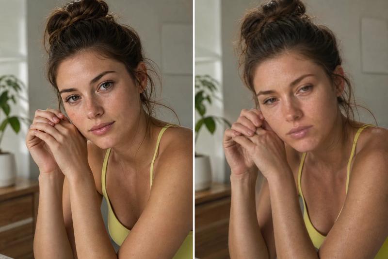
When you use Apiframe in production, treat each generation as a background job. Send the prompt and the model, then check the job status or let a webhook (an automatic message sent to your server when a job finishes) call your app when the image is ready. That lets you store the prompt, seed, settings, and result together for later review. Our guide on setting up webhook callbacks walks through the setup.
One rule will save you time: change one setting per test batch. If you change the lens, the light, the aspect ratio, and the guidance all at once, you will not know which choice fixed the problem.
Why More Detail Does Not Always Mean More Realism
More prompt detail can improve a result, but it can also bury the main idea. This is one of the most important parts of how prompt engineering affects photorealistic output.
A model reads your prompt as a series of small text pieces and weighs them against each other. A very long prompt can weaken the core subject because too many details compete for attention. A prompt can also contradict itself, such as “minimal studio portrait” next to “busy street crowd,” or “soft diffused light” next to “hard midday shadows.”
Start with the main decision. Is it a portrait, a product shot, an interior, a landscape, or an action frame? State that first. Then add the light and the camera position. Add texture only where it will actually be visible.
Remove any phrase that does not change the image. “Beautiful,” “perfect,” and “stunning” are weak instructions. “Visible pores around the cheeks” is stronger because it names something the model can actually draw.
Use a small test loop:
- Write a short prompt with one clear subject and scene.
- Generate three candidates with the same model and aspect ratio.
- Change one variable, such as the light direction.
- Generate three more candidates.
- Compare anatomy, texture, background geometry, and how closely each image follows the prompt.
Judge the whole set, not the luckiest frame. A single attractive image can hide a weak prompt. If the light you asked for shows up across several outputs, the wording is doing real work.
For identity or product consistency, text alone may not be enough. Use a reference image when the model supports it, and keep the subject description stable across generations. Our guides on using reference images and keeping AI characters consistent cover this in more detail. Reusing a seed will not reliably preserve a face, so character consistency needs its own approach.
Photorealism is also not the same as being accurate. An image can look like a photograph while showing the wrong product shape, a false label, or impossible anatomy. Review the details at full size before you send an image to customers.
The best prompt is usually the shortest one that settles the visible decisions. Add detail when you can point to the exact change it should make.
FAQ
How does prompt engineering affect photorealistic output?
Prompt engineering affects photorealistic output by pointing the model at specific photographic cues. Camera position, focal length, light direction, texture, framing, and negative terms all reduce guesswork. A clear prompt leaves the model fewer plausible readings, so the result is more likely to show believable depth, shadows, materials, and anatomy.
What prompt element matters most for realism?
Lighting is often the strongest element for realism, because viewers quickly notice false shadows and flat surfaces. Name the light source, its direction, how soft it is, and what it does to the subject. “Soft window light from the left with gentle cheek shadows” gives a better target than “professional lighting.”
Should I always include a camera and lens?
Include camera and lens cues when perspective or focus matters. A 35mm lens can suggest a wider scene, while an 85mm lens points toward portrait framing and background separation. These terms guide the look, but they do not guarantee real optical behavior, so check the distortion and background blur in the final image.
Can negative prompts make an image less realistic?
Yes. Negative prompts can reduce realism when they get too long or clash with the main prompt. Start with a few likely errors, such as blur, extra fingers, watermarks, or plastic skin. Add a new exclusion only after you see the same issue repeat in your own tests.
Does a longer prompt produce a better AI image?
Not always. Extra words can dilute the subject or introduce conflicting instructions. State the subject first, then settle the environment, lighting, framing, and visible textures. Remove terms that do not change the frame, and test one edit at a time.
Conclusion
Build photorealistic prompts around visible facts, not piles of praise. Start with the subject, define the light, add a lens and a frame, then use a short negative prompt. If you are testing models inside a product, run the same prompt through Apiframe’s unified image API and compare the results before you commit to one model. Our Getting Started with Apiframe guide shows how to send your first request, and our roundup of AI image generator APIs can help you choose which models to test.